caroline song :-)
communications designer @ carnegie mellon
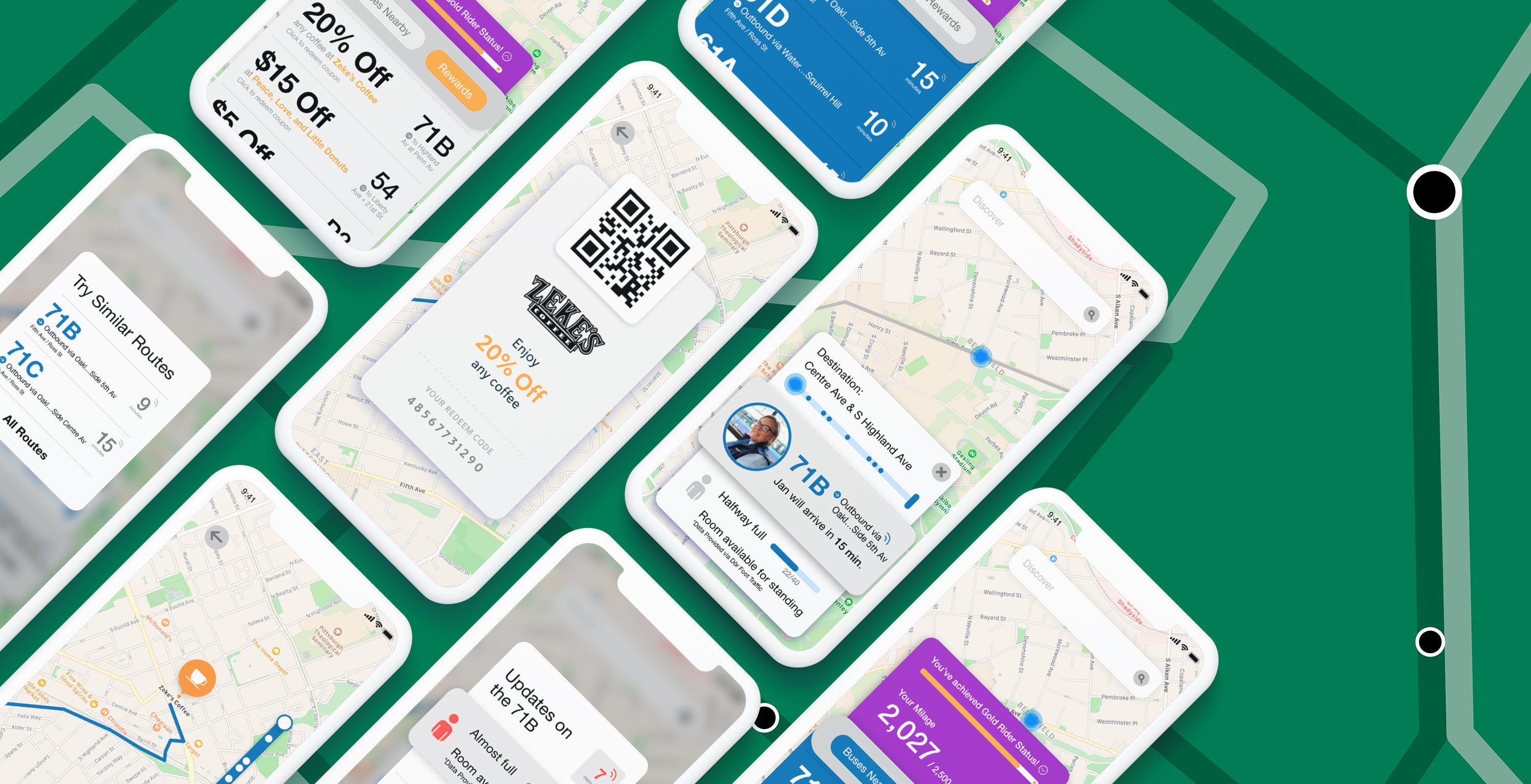
Fall 2019, 8 weeks
Using quantitative and qualitative methods, our team took a human-centered approach
to creating a bus experience that makes data more transparent to riders, fosters driver/rider relationships, and overall, incentivizes students to see public transit as a viable and trustworthy transportation method.
In enacting this intervention, our team hoped to improve and design for the broader idea of mobility for service.
Mobility for service = providing multiple options on a single app for people to have agency in choosing their mode of travel.
Figma
Adobe XD
Adobe Illustrator
User Research
Prototyping
Process Documentation
Elizabeth Han
Stefanie Suk
Yoshi Torralva
Problem Space –
How might we allow students to feel more at ease when exploring Pittsburgh via public transportation?
Though the public transportation system is one of the most cost-effective and sustainable transportation options today, many students hold a negative view of the system due to various factors, including lack of reliability regarding bus arrival times, as well as the absence of personal space. This cynical outlook has translated into students distrusting and disregarding the public transportation system as a reliable option in any situation.
Our resulting intervention addresses the most common pain-points we discovered through our research, incorporating them all into an app extension that existing transportation apps can incorporate, so to prevent the introduction of yet another transportation app into the midst of the millions of apps that already exist.
For our messy thought process: Check out our Medium Post →
Real Time Rider Data –
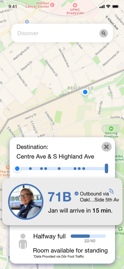
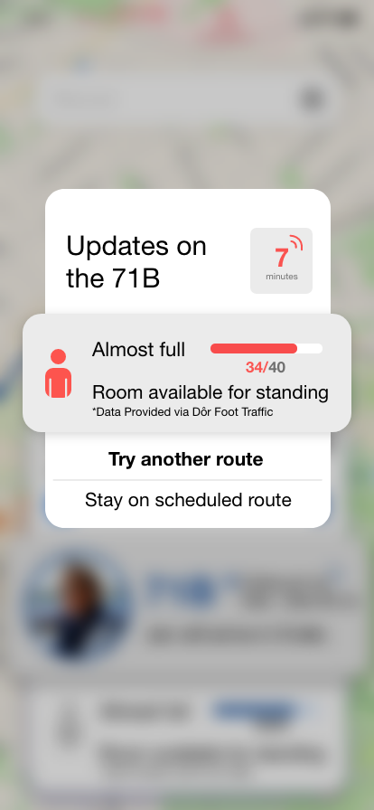
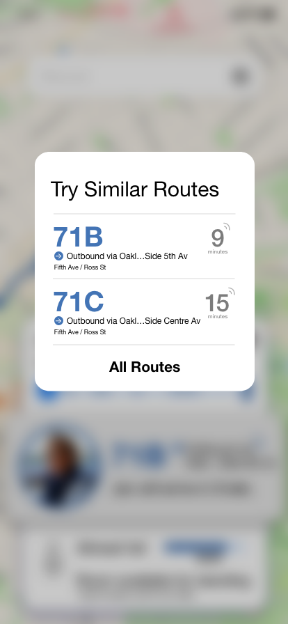
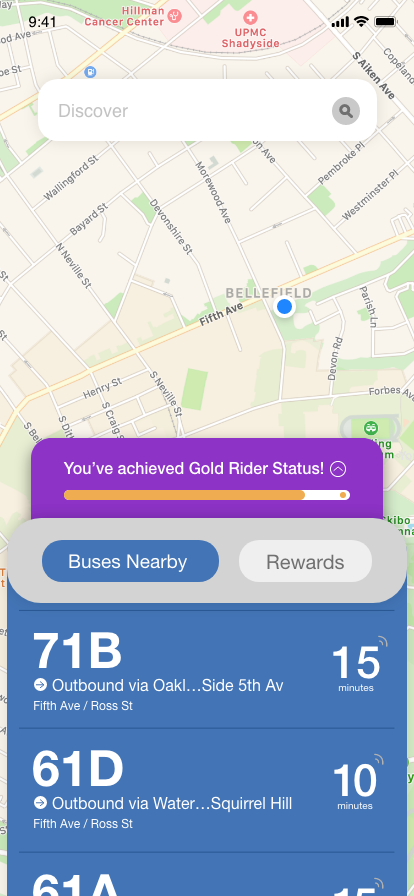
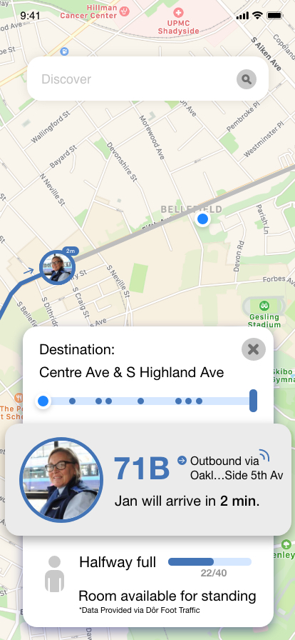
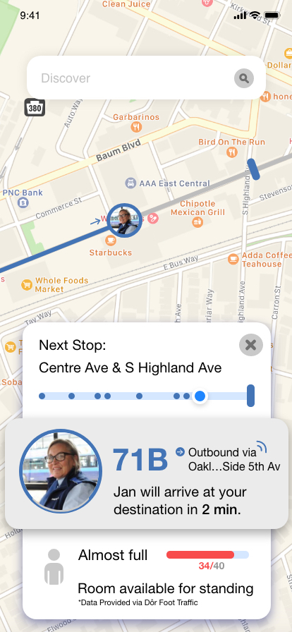
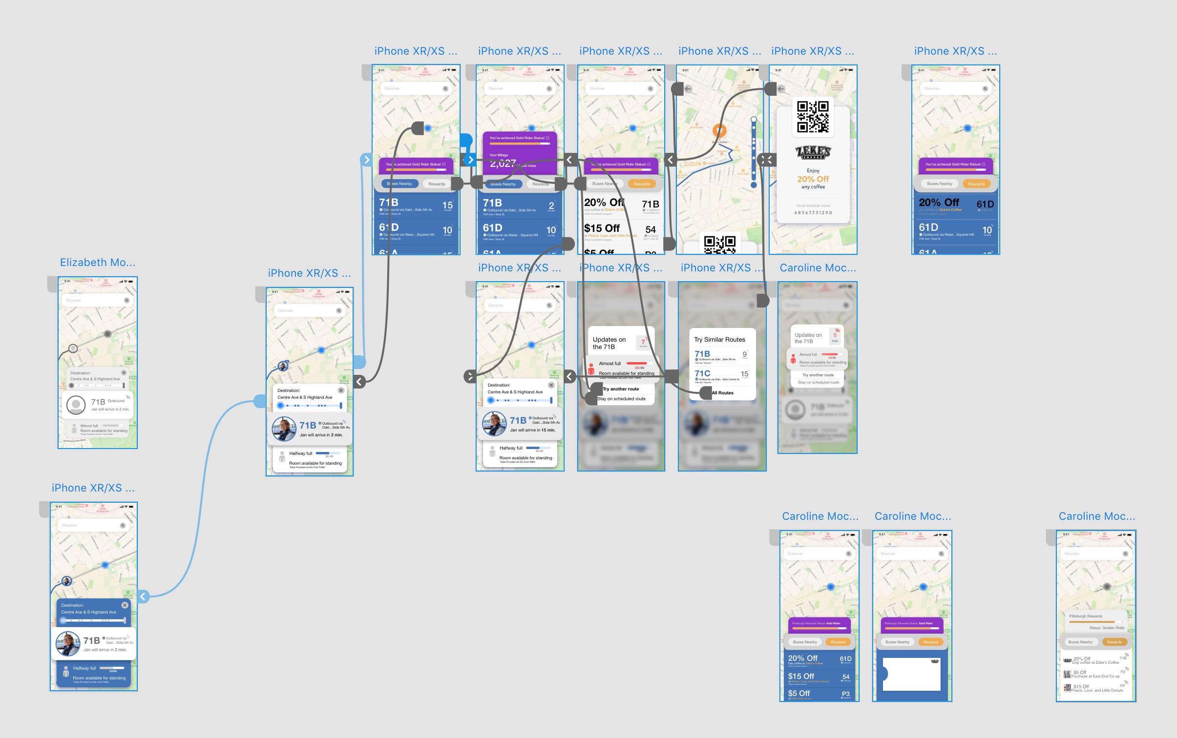
Foot traffic monitors on bus doors allow transit applications to provide users with information regarding how many riders are currently on their desired bus. When nearing full capacity, an alert appears to warn the rider and reroute them if desired.
Humanizing the Bus Experience –
Driver profiles are made visible on transit apps (much like the profiles on Uber/Lyft). The goal is to allow riders to be more comfortable using public transport with the drivers being more humanized and approachable. Drivers also have a mobile device on board that will be able to send more accurate location data.
The Rewards System –
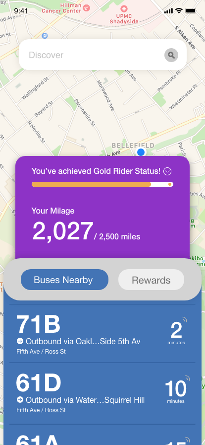
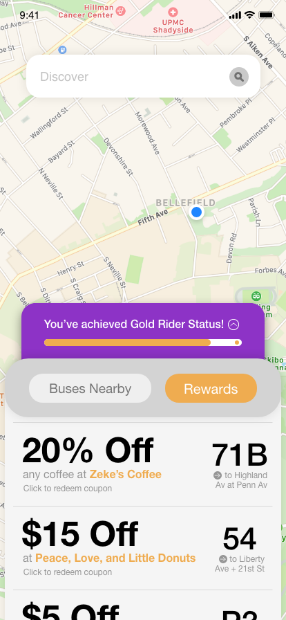
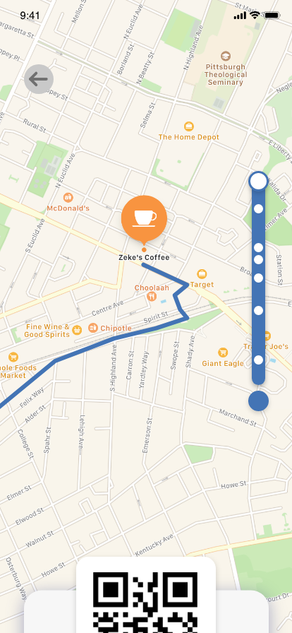
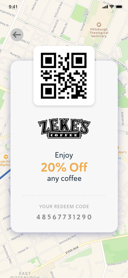
A rewards system is implemented by collaborating with local businesses. Riders will be able to achieve statuses as they continue to use the public bus system, earning rewards along the way. Different deals for various businesses will be shown, with directions on how to get there via public transport provided.
01 Stakeholders –
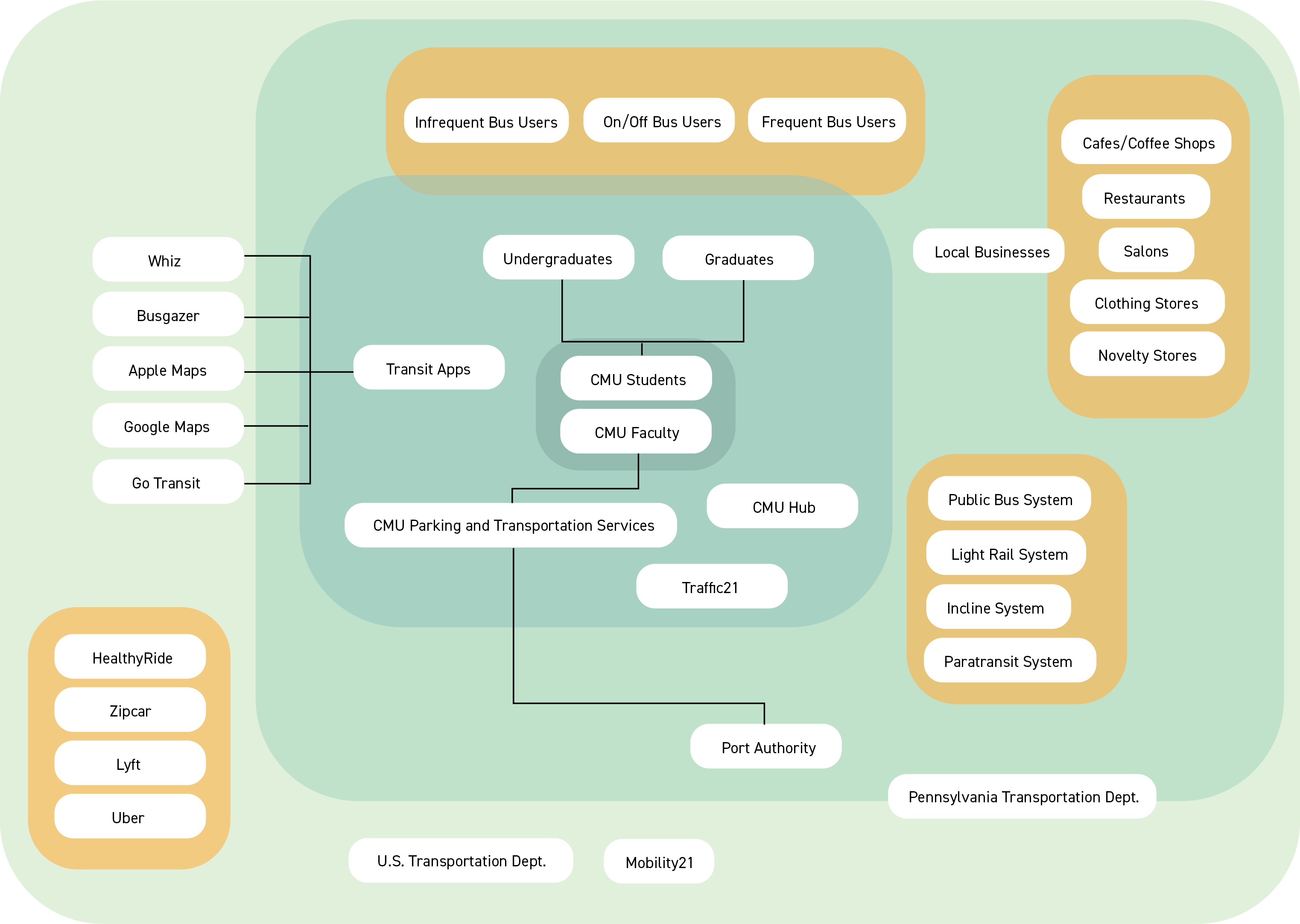
Our team began with mapping out the various stakeholders that are affected by the public transportation system in order to determine who we are designing for. As we continued this exercise, we saw an emergence of key groups within the stakeholders to take into account as we started to move forward with our research.
02 Research –
For the next four weeks, our team was able to conduct three methods of research to enhance our understanding of our stakeholders’ relationship with public transport.
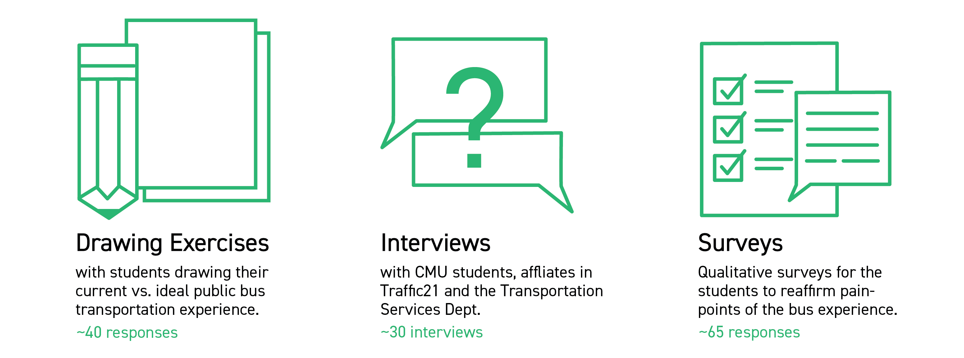
Through the drawing exercises and surveys, our group was able to gain some valuable insight on different aspects of what students wanted out of their bus experience, which helped hone us down even more to what problems we as a group wanted to tackle. There were three main painpoints we found through our research:
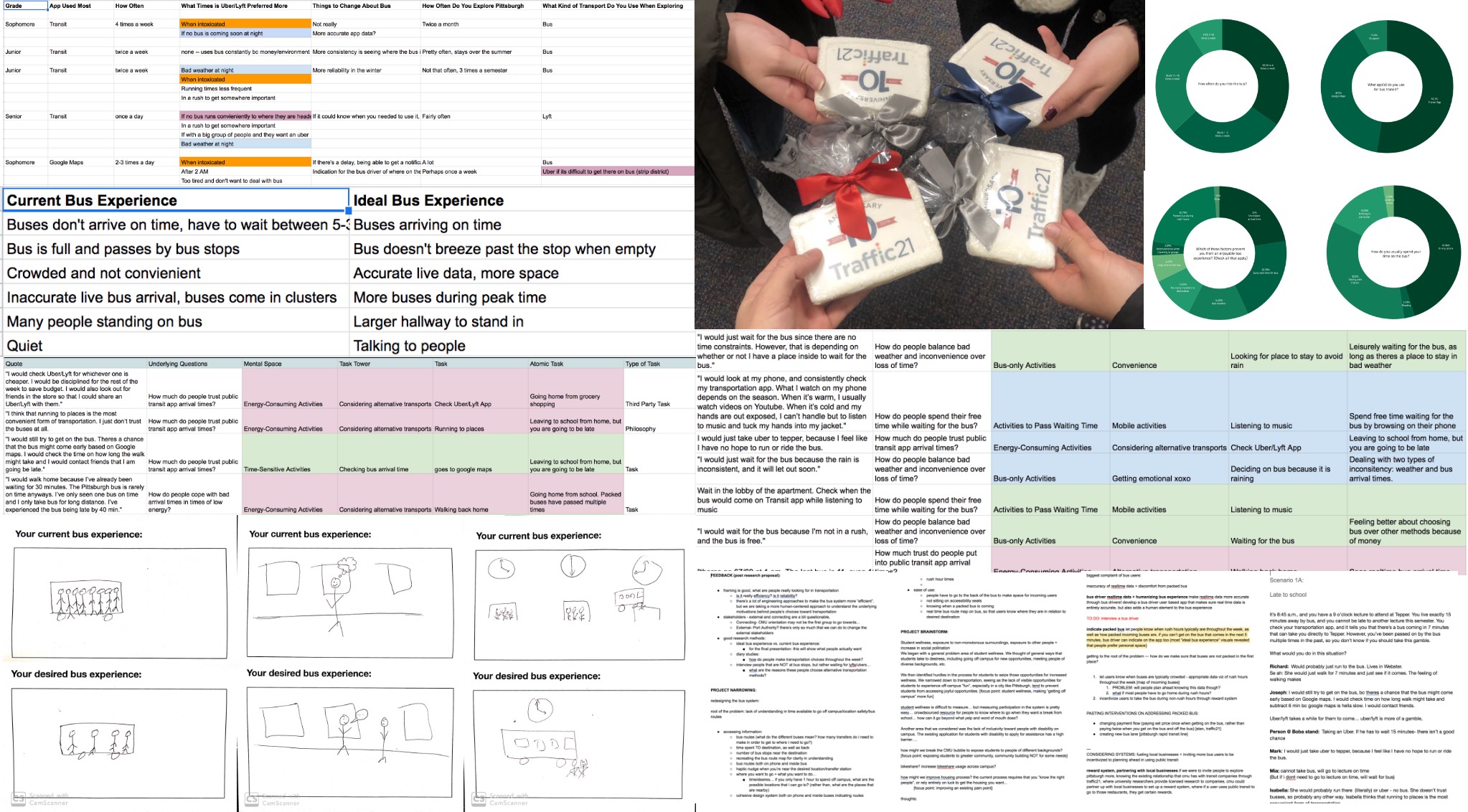
Samples of Drawing Exercises, Interviews, and Survey Results
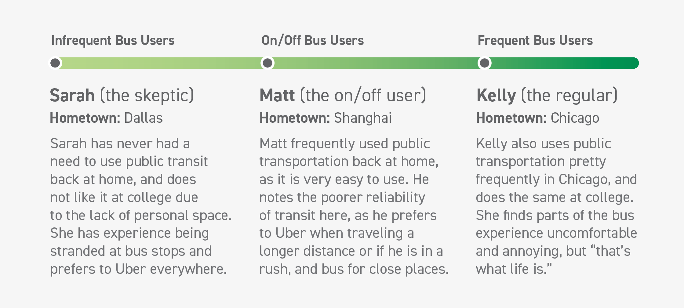
Based on our in-person interviews, we created three brief user personas that portray the frequent/moderate/rare rider spectrum found in our target stakeholders. In doing so, we created a more robust description of who our intervention would be targeted towards.
02 Research Findings –
We found common pain-points amongst the students regarding the public transportation system:
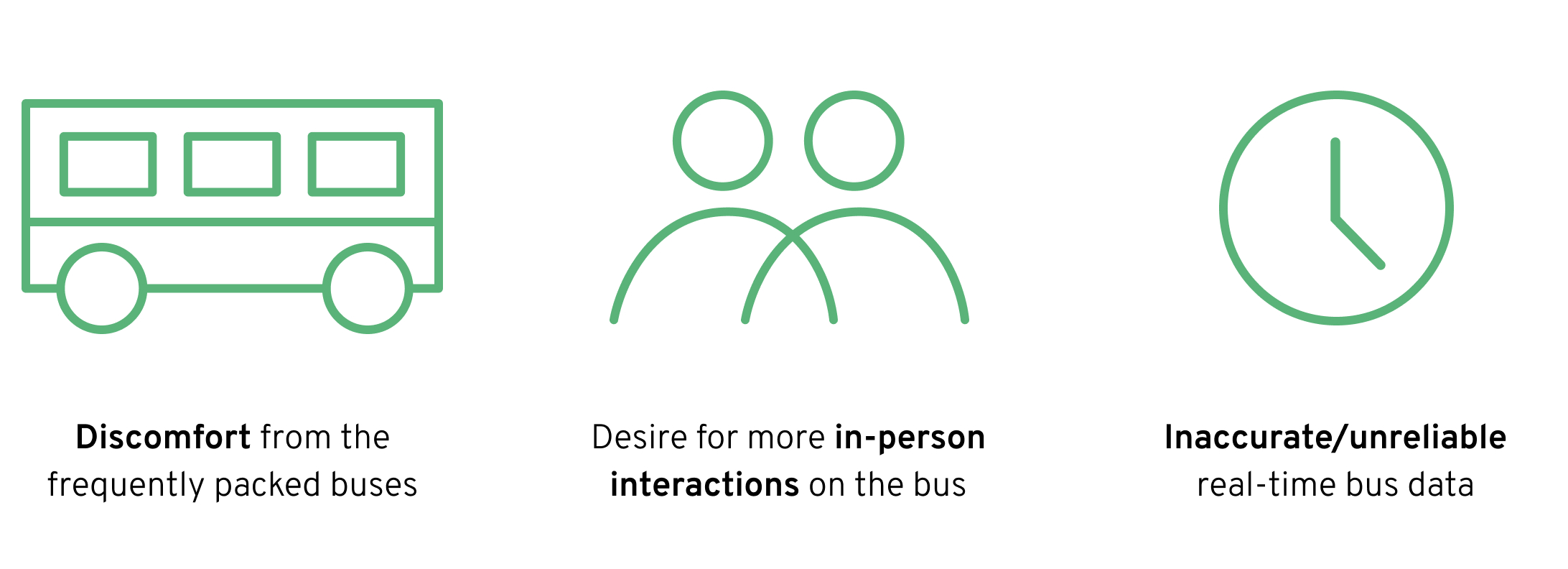
In addition to the pain-points that we found in our research, we also were able to discover some key takeaways that would help inform the rest of our design process.
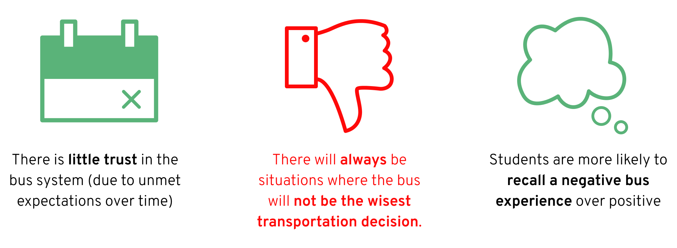
The most important takeaway we found was that the bus will not always be the best transportation decision for every situation in which a student is in need of transport. Delving further into this realization, our team discovered these underlying value systems that come into play, and clash, when having to choose a transportation method:

Moments where students make an ill-informed decision in a transportation method are a result from decision fatigue or the inaccuracy of realtime data.
03 Prototyping –
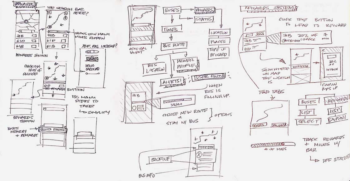
Rather than unrealistically trying to force students to choose public transportation in every scenario, our team sought to counteract the strong stigma against public transit by addressing the most common pain-points.
The goal was to allow students to see the viability in public transit so that their stigma would not get in the way of making the best transportation decision for their situation.
Final Thoughts –
The idea of mobility for service was our team’s motto. The future as we see it, is to have transportation methods working in tandem to better service people. We hope that this intervention is a step forward in servicing that idea.
There are always going to be some moments where public transportation will be simply inconvenient. This app extension is not about forcing users to choose the bus in every situation, but about allowing public transportation to be on a level playing field with all the other transportation methods. It is about providing users with the information they need to make the best transportation decision in their situation, reducing their decision fatigue, and overall, leading to a more positive bus experience.